Product Page Redesign: Juniper Networks Case Study
An engaging and effective product page template that aligns with Juniper’s UX and UI workflow.
-
Web Design Case Study
-
Designer
-
Figma
-
Dec 2024 - March 2025
Brief
This project was a comprehensive introductory look into UX/UI and Figma. My task was to research and design a unique page template for Juniper’s products. These pages are dedicated to providing users with more information about the products, and ways to connect with the Sales team to purchase said products. The target demographic are professionals in the IT field, that are looking for advanced IT solutions. While the products can be technical, the content should be simple and easy to comprehend. My goal is to help drive customers into our sales pipeline.
Project Elements
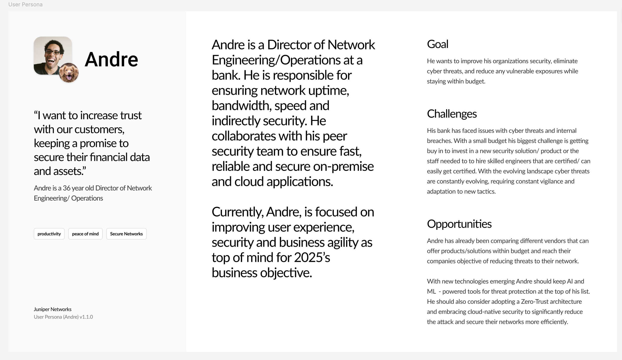
Create a user persona for someone who is interested in learning about Juniper’s products
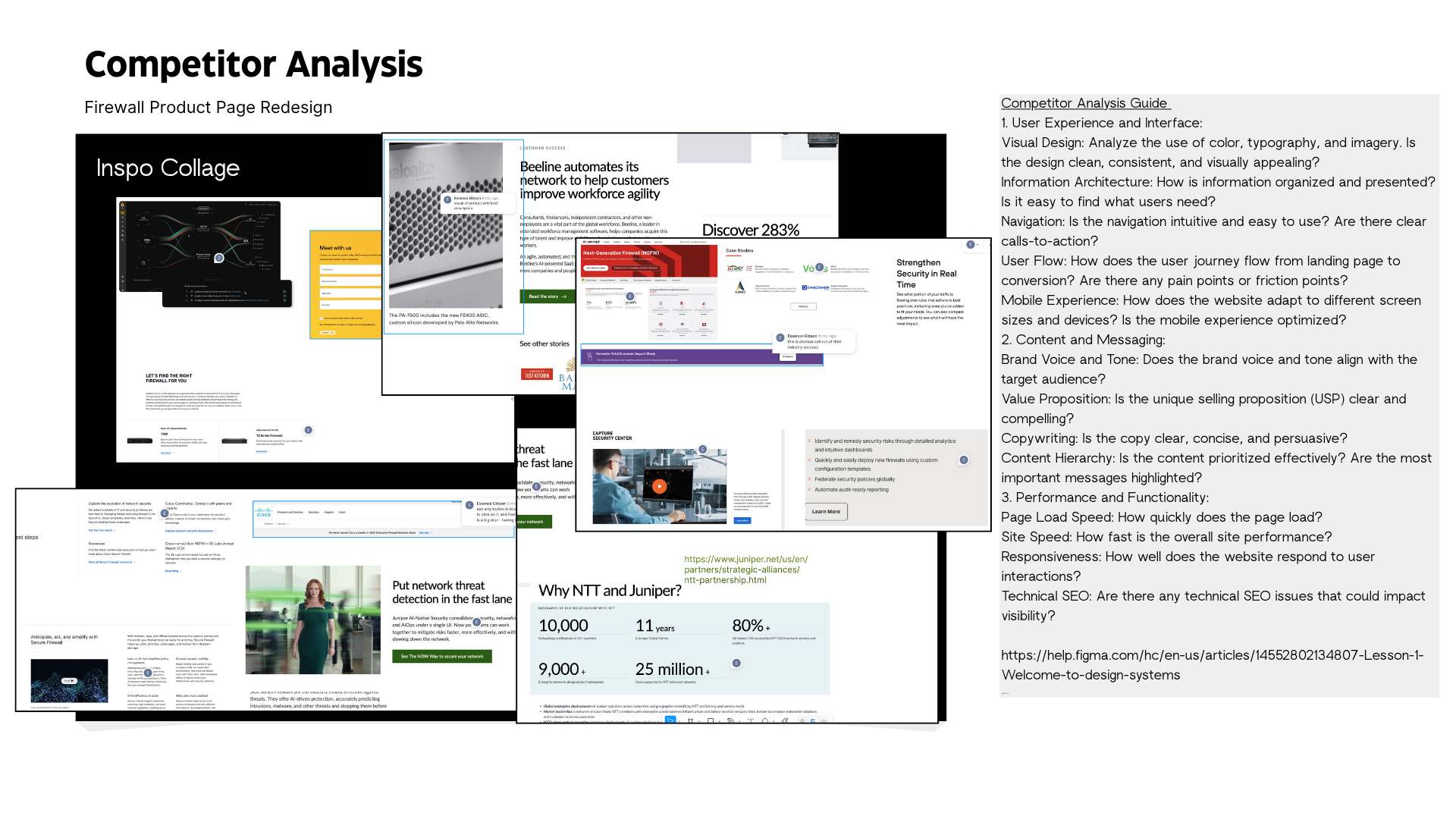
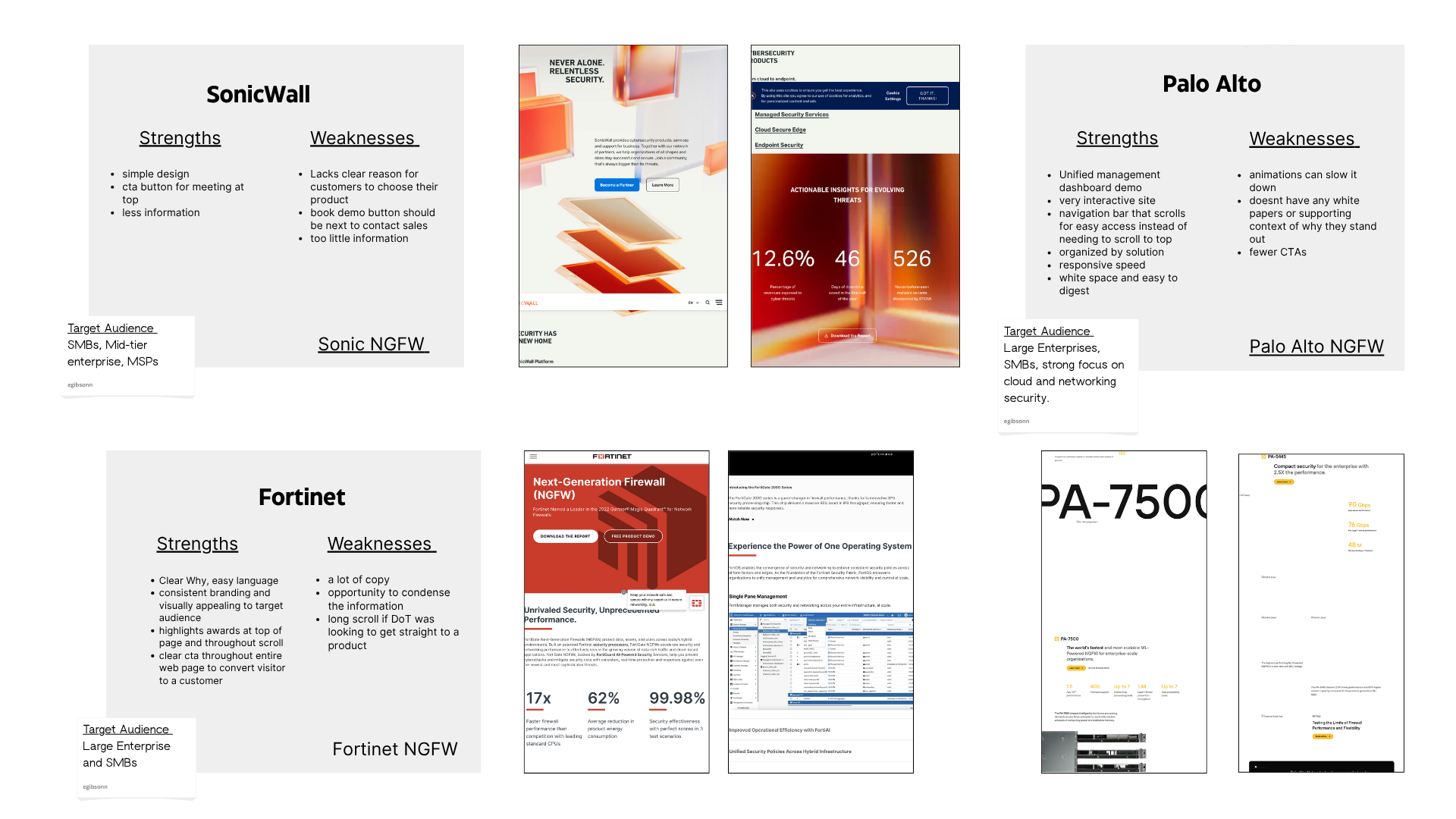
Find and compile examples of product pages created by competitors
Alternative, find similar types of pages from major enterprise companies
Create a wireframe in the UI project of a potential product page
Project Goals
As an introduction to UX, UI, and Figma, I will iteratively build a comprehensive project focused on improving Juniper’s product page template.
To summarize:
Improved proficiency with Figma and it’s tools
Improved understanding of common UX practices
Improved understanding of UI terminology and concepts
User Persona
Competitor Analysis

UNDERSTANDING THE USER
The Design
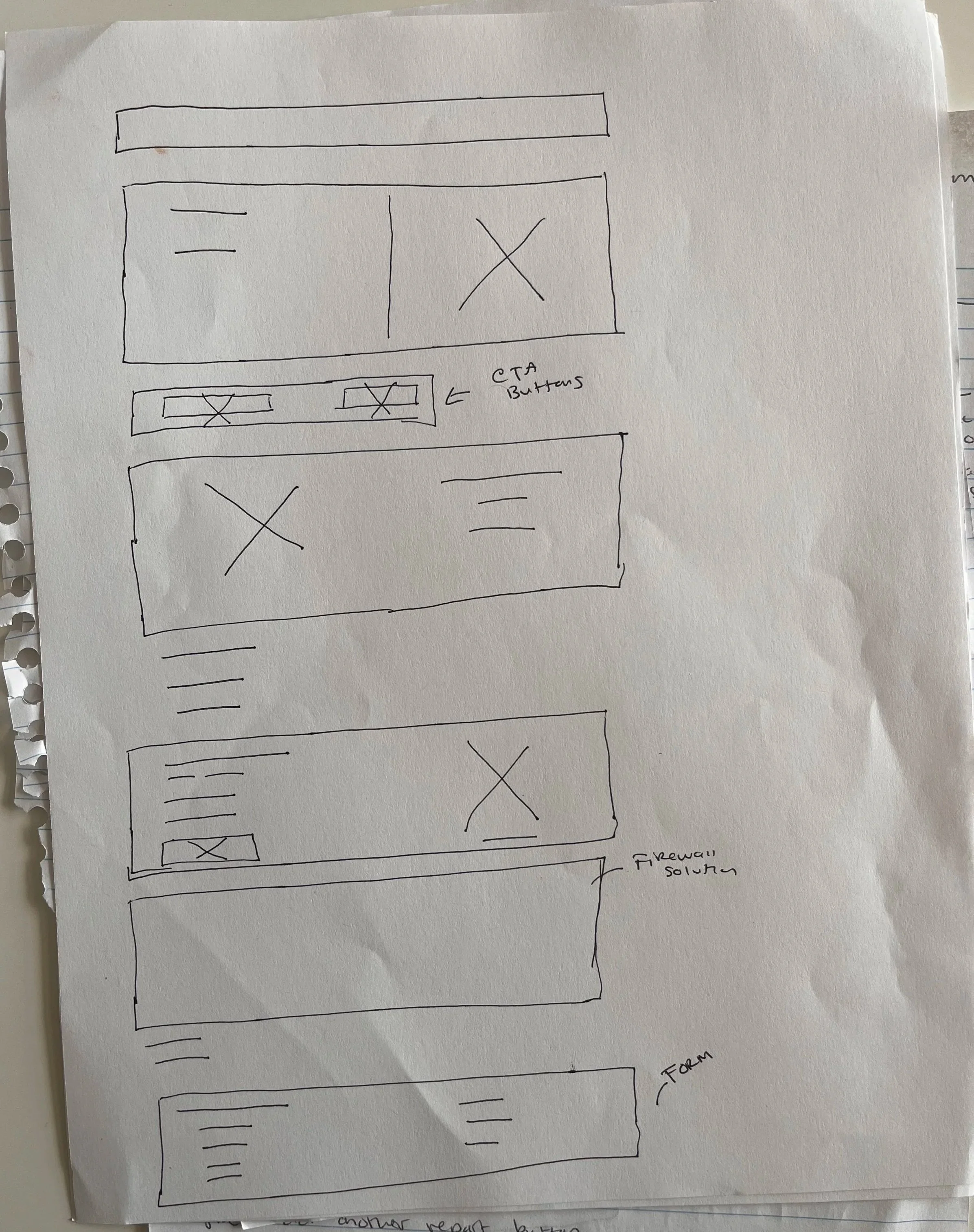
Paper Wireframes
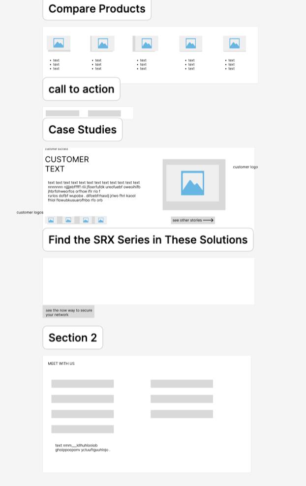
I began by paper wireframing, keeping the user persona (a Director of Network Engineering) in mind. I prioritized key content like a customer success video and a product demo on the homepage to allow users to engage with the solution immediately, reducing the need to search through technical details.
Mockups
Low Fidelity
I used a persistent navigation bar and a prominent call-to-action to give users easy access to products and a clear path to conversion as they scroll.
High Fidelity Mockups
Above the fold
The original homepage was too generic, lacking a clear message and a compelling visual. I solved this by redesigning the hero section to immediately showcase the product's value with a benefit-driven headline and a specific image. Prominently placing key actions like “Contact Sales” and “Request a Demo” now gives high-level users a clear path to engagement.
Below the fold
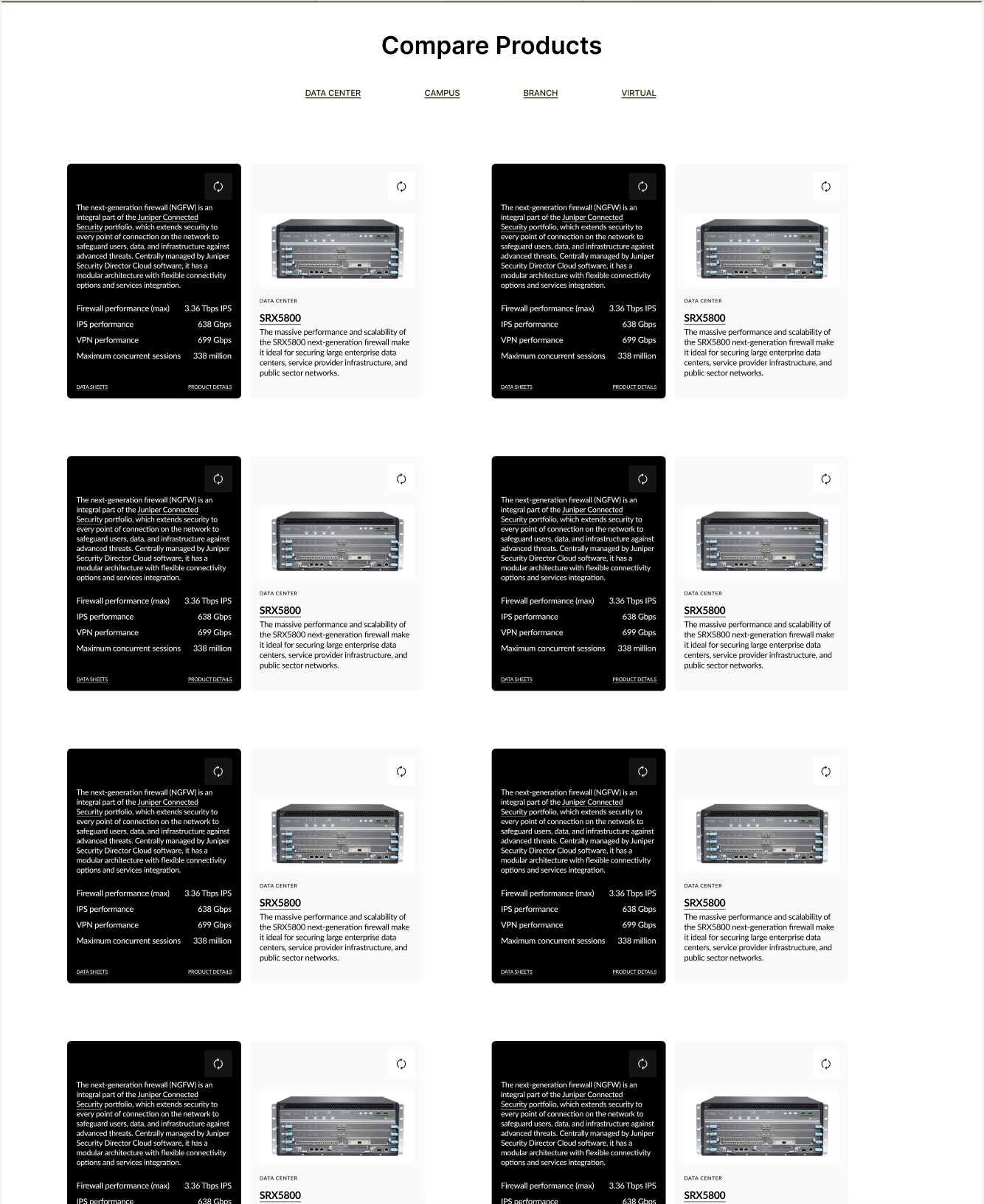
The original layout featured overlooked data reports, unclear filters, and required users to click away to view specs. My redesigned approach solves these issues by:
Bringing industry success reports and customer stories to the forefront to establish credibility.
Adding a prominent filter bar for easy sorting by product and location.
Integrating interactive flip-cards on products, allowing users to view specs instantly and streamlining the comparison experience.

After
After
Before
Before


Going Forward
Takeaways
Impact:
The redesigned product page delivers a more intuitive and trustworthy experience by highlighting success stories and streamlining product comparisons. This new layout reduces the user's cognitive load, helping high-level professionals quickly grasp value and take action with confidence.
Next Steps
Expand the scope of the user research:
To further validate the design, I would conduct user interviews and usability tests, building low and high-fidelity prototypes based on my findings.