
A mobile app that empowers plant parents of all levels to confidently care for their plants by providing accurate diagnoses of plant issues and offering tailored care recommendations for healthy and happy plants.
Grow Well: Plant Care App
-
Mobile App Case Study
-
UX/UI Designer, Researcher, Copywriter, Brand Designer
-
Figma
Canva
-
Oct 2024 - July 2025
CHALLENGE
Plant owners struggle with diagnosing their plants and keeping them healthy. They become overwhelmed with care recommendations online.
GOAL
This project aims to create a user-friendly mobile application that empowers plant owners to confidently identify and address plant problems by providing instant diagnoses from visual input and delivering clear, actionable care advice.
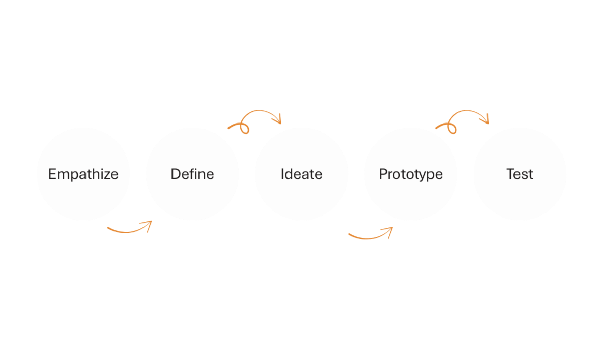
Design Process
UNDERSTANDING THE USER
User Research Summary
New plant owners often struggle to understand their plants’ specific needs, like watering, fertilization, and light. I identified this core problem by synthesizing insights from three key sources:
Anecdotal conversations: Friends who are new to plant care shared their common struggles.
Social media analysis: I observed plant influencers highlighting frequent mistakes made by beginners.
Competitive analysis: A review of existing plant care apps revealed a lack of clear, actionable guidance.
Though this was a simulated project without direct user interviews, these findings defined the key challenges the application needed to solve.
User Pain Points
I need to diagnose my plants
Plant care is complex due to the diverse needs of different species. Users require a clear and intuitive way to understand what their specific plant needs, whether it's adjusting watering, fertilization, or light exposure. Providing a diagnostic feature will empower users to accurately identify their plant's requirements and take appropriate action, leading to improved plant health and user confidence.
I need reminders about my plants
Users with busy schedules often find it challenging to remember consistent plant care tasks. Integrating a reminder system and calendar functionality can proactively address this by helping users stay on track with watering, fertilizing, and other essential plant needs, ultimately contributing to healthier plants and reducing user frustration.
User Persona
Kelly is 35 and a successful global marketing director for a retail chain with a demanding travel schedule. While she values the serene atmosphere her plants provide, her busy work life makes it difficult to maintain a consistent care routine, leading to missed watering and signs of plant distress. She needs a way to stay informed about and manage her plant care schedule and understand what her plants need.
“I love my plants and the tranquility that they bring me but I am so busy lately that I don’t know what they need.”
Age: 35
Education: Bachelors
Hometown: Laguna, CA
Family: Single
Occupation: Global Marketing Director

Goals
Effortlessly maintain a consistent plant care schedule despite frequent travel and a demanding work life.
Quickly assess the current needs of her plants upon returning home, minimizing the guesswork involved in determining what care is immediately required.
Proactively receive timely reminders and insights into potential plant issues before they become severe, even when she's away.
Challenges
The conflict between her desire for a tranquil, plant-filled home and the reality of her inconsistent presence making it difficult to provide regular care.
The mental burden of trying to remember past plant care activities and anticipate current needs, especially after periods of travel.
Feeling guilty and frustrated when she returns home to find her plants showing signs of neglect (leaf drop, browning) due to her inability to maintain a routine.
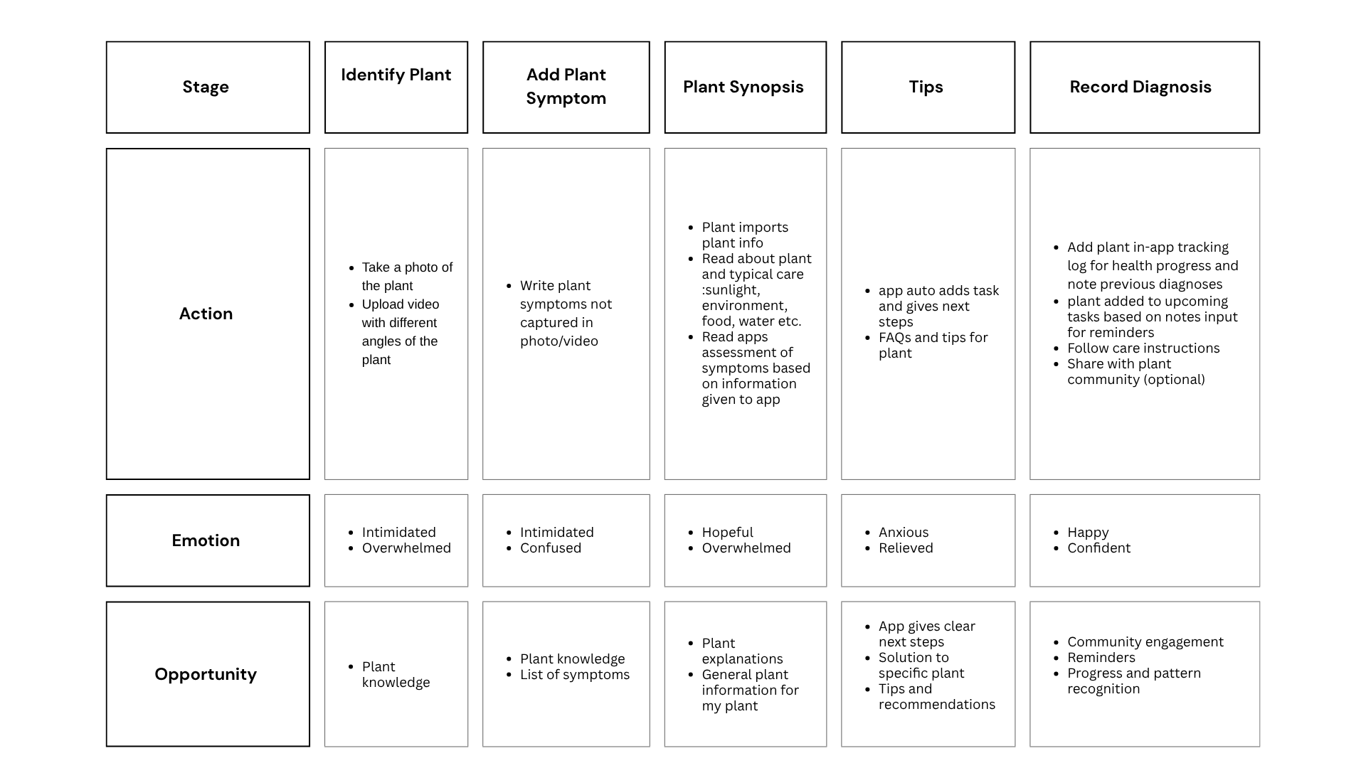
User Journey Map
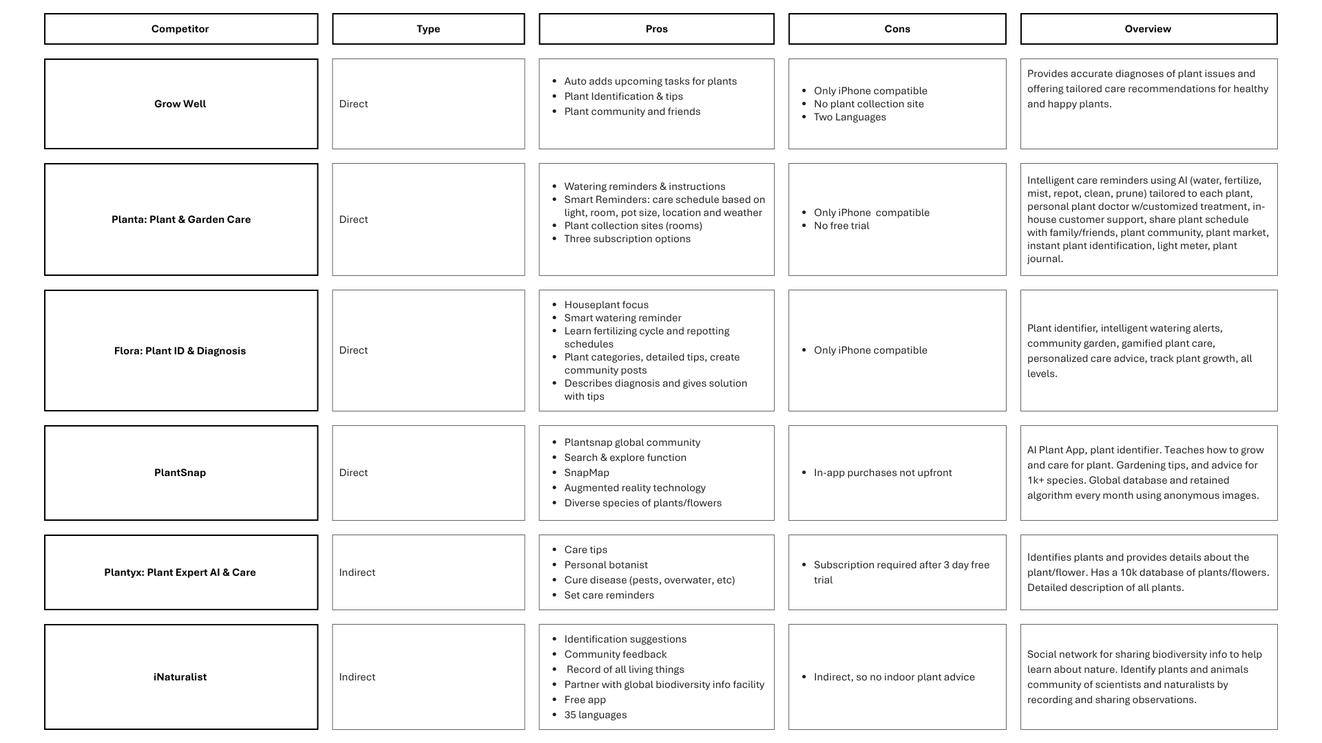
Competitor Analysis
The Design
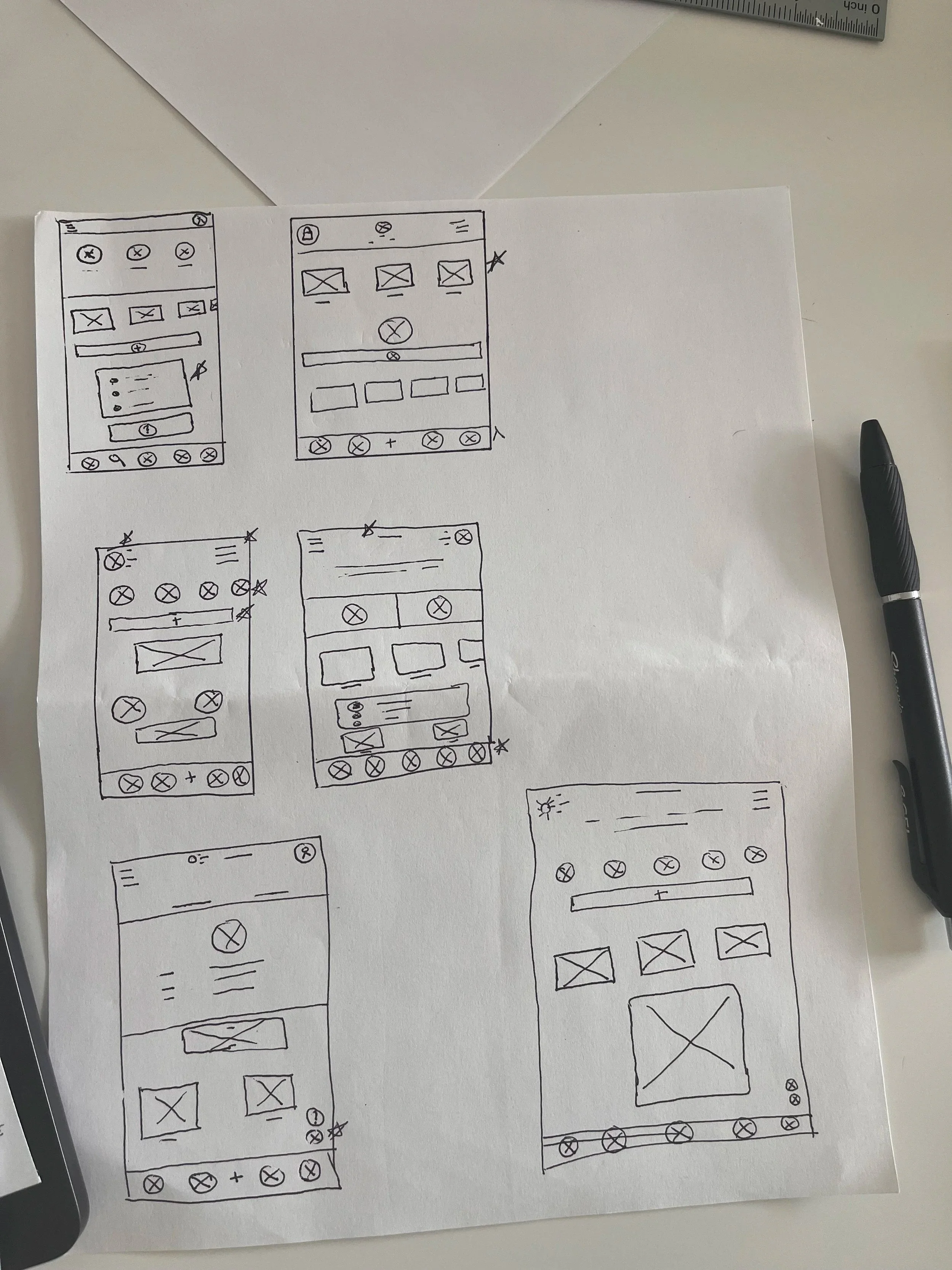
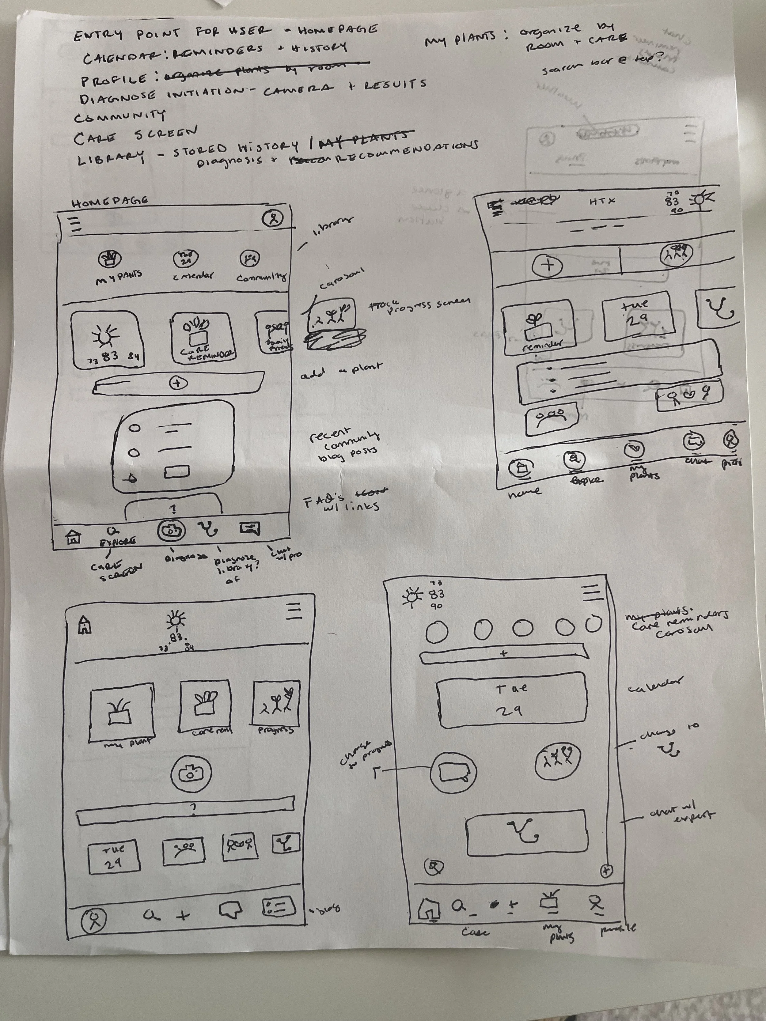
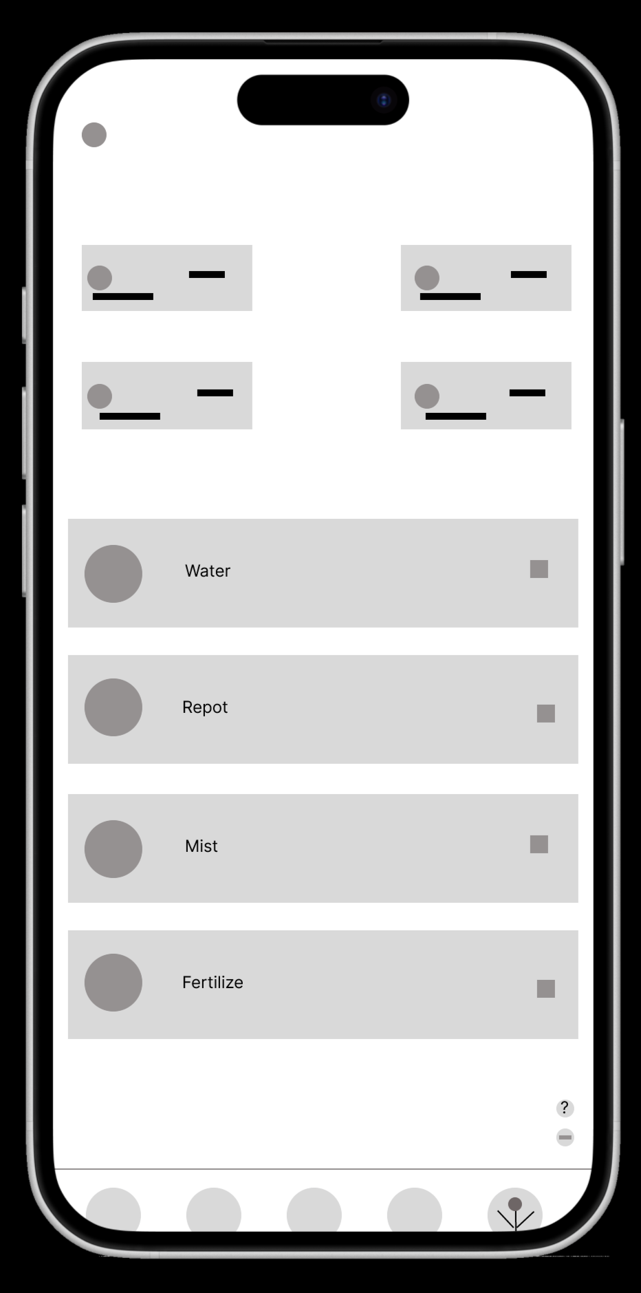
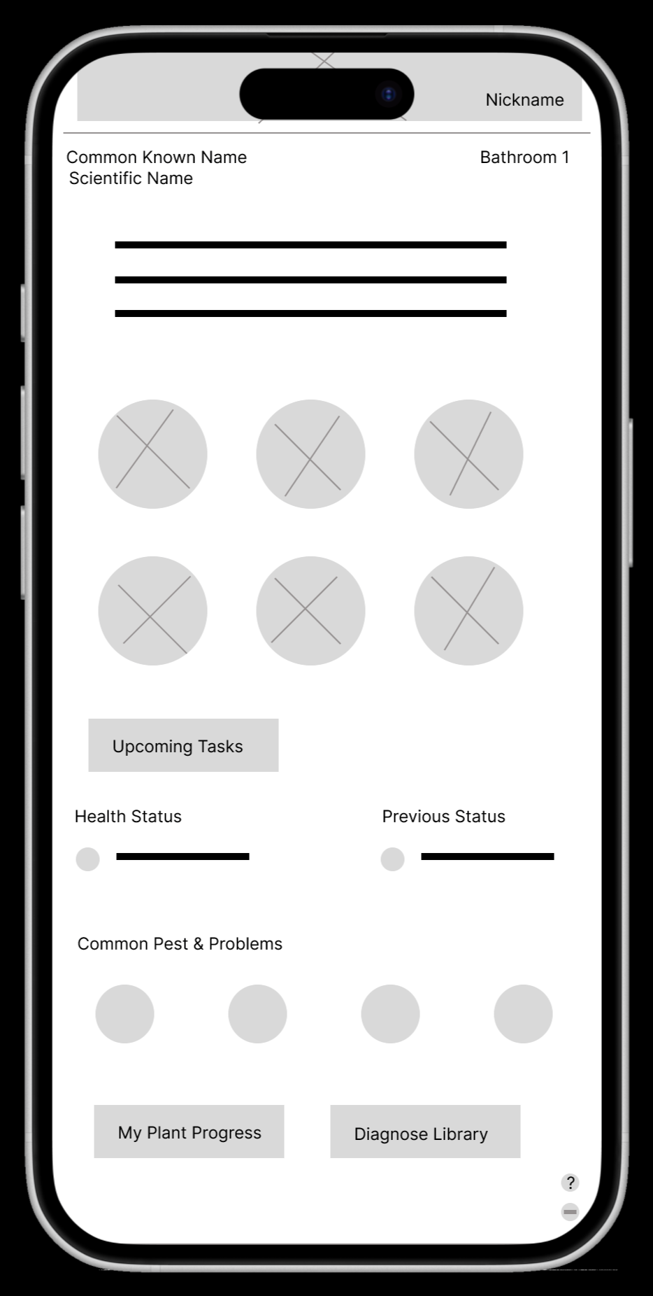
Paper Wireframes
To address the user's core needs for diagnostics and reminders, my paper wireframes prioritize functionality and a clear hierarchy. The top of the page features the most critical functions: "My Plants" and "Add new plant." A streamlined navigation bar provides easy access to key areas like "Diagnose" and "Care Reminders." The design also includes clear pathways to a community blog and professional support, ensuring users can find what they need and connect with others, all while maintaining a competitive layout.
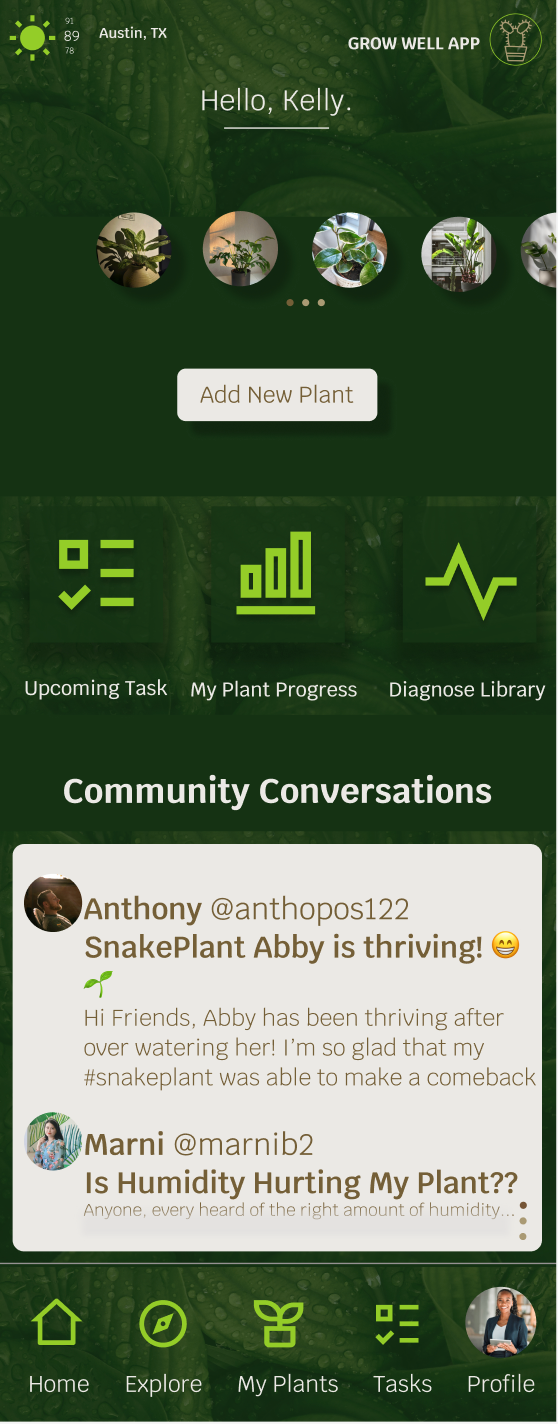
Location, local weather, greeting, and logo.
‘Add New Plant’ button gives user immediate access to add new plants and create profiles for the plants, diagnose, or set reminders.
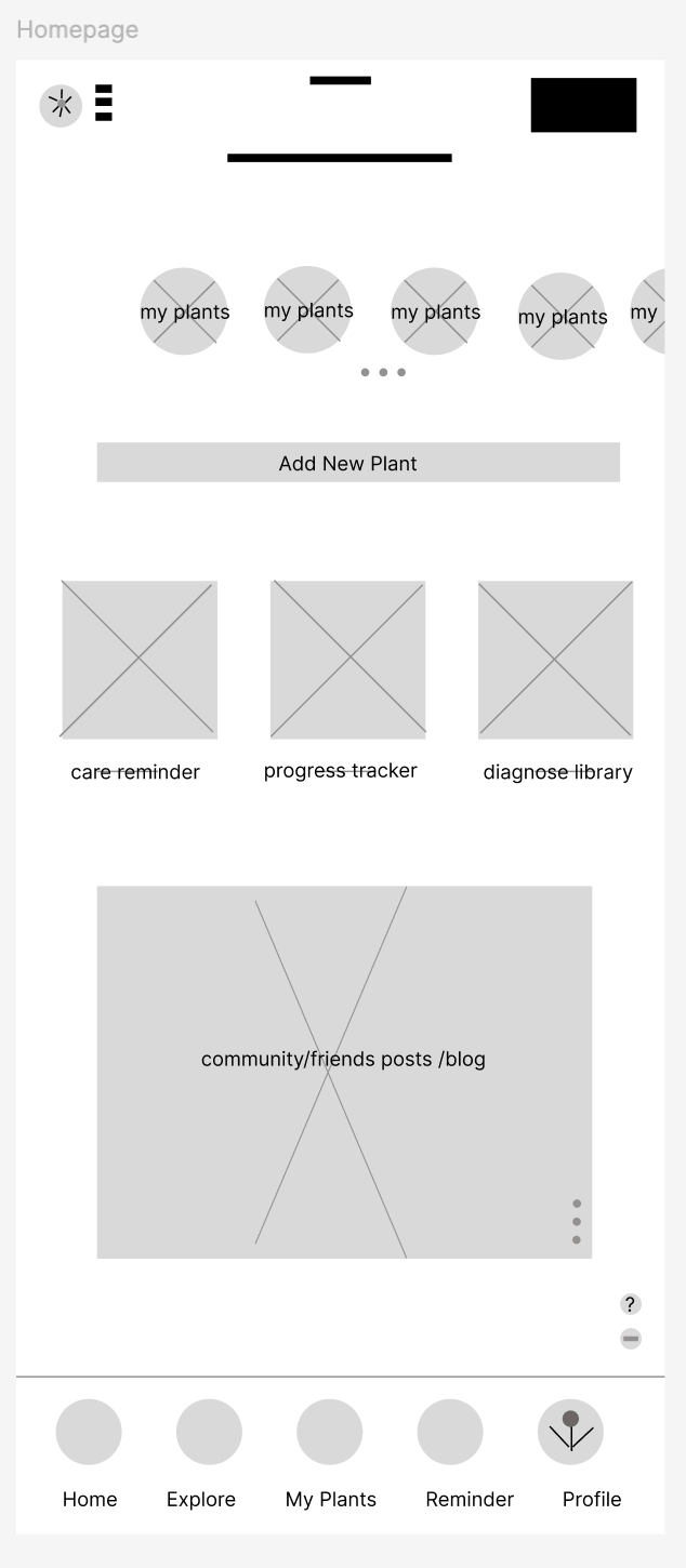
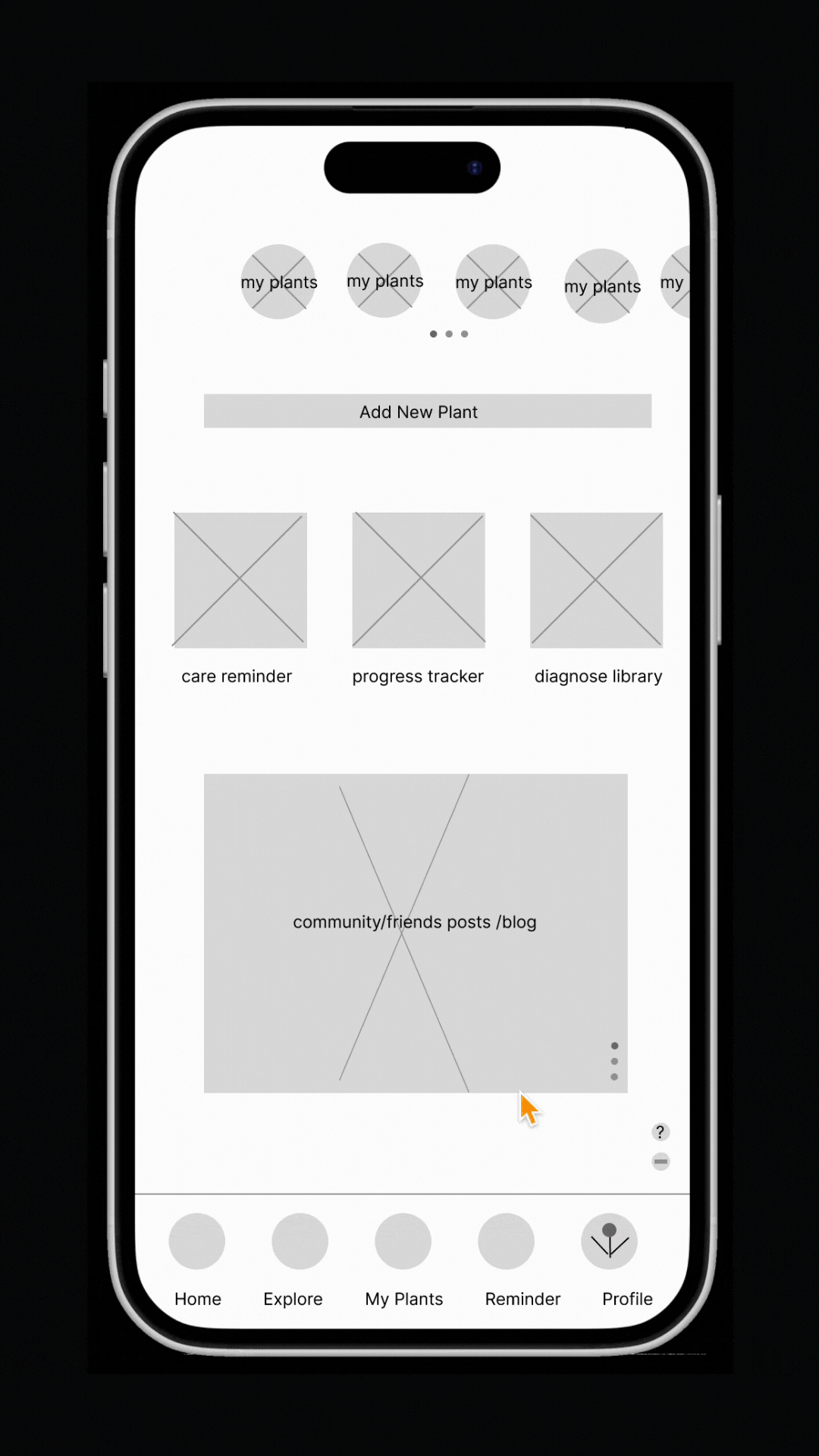
Digital Wireframes
Low Fidelity Prototype
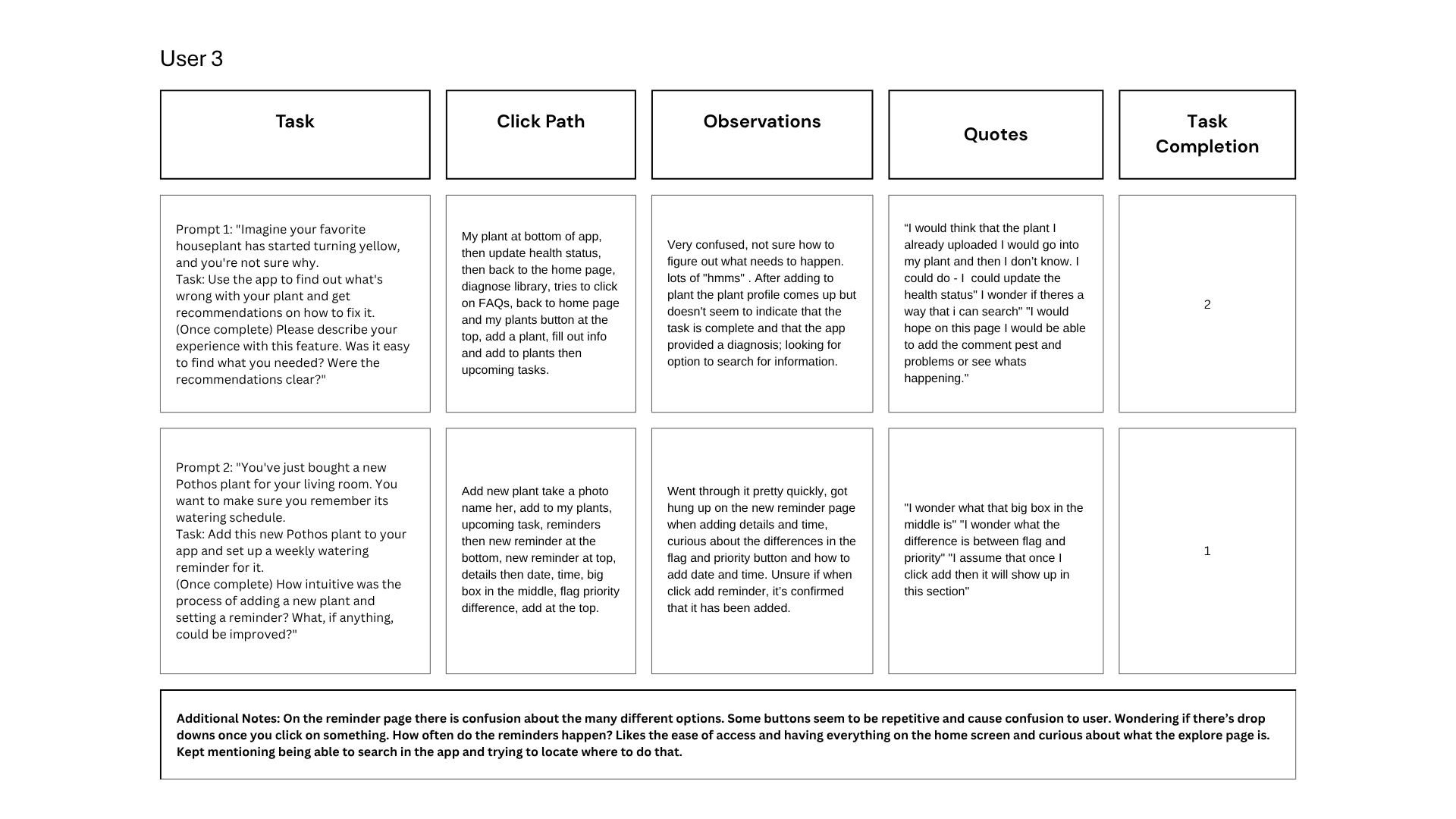
Usability Study: Notes
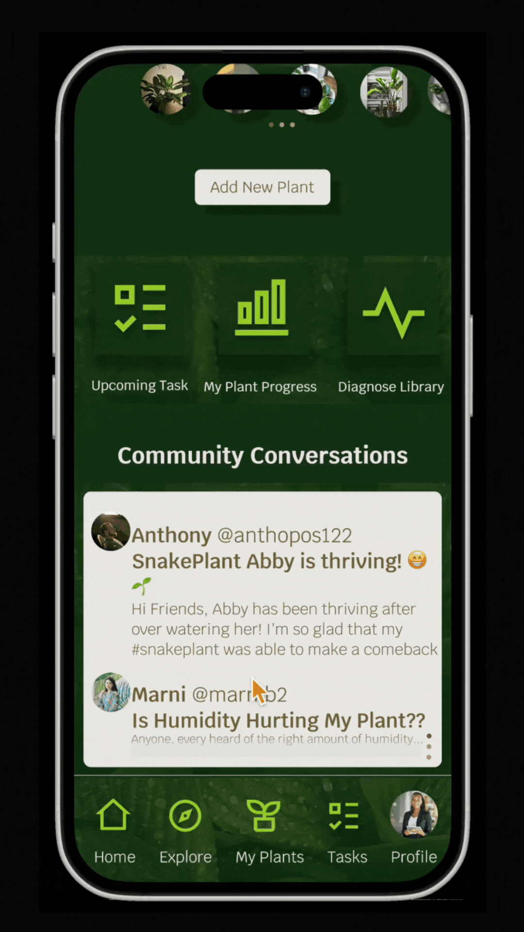
Carousel of all plants and easy access to direct plant profile.
Scrolling posts of blogs and friend community, acts as a button to go to friends page.
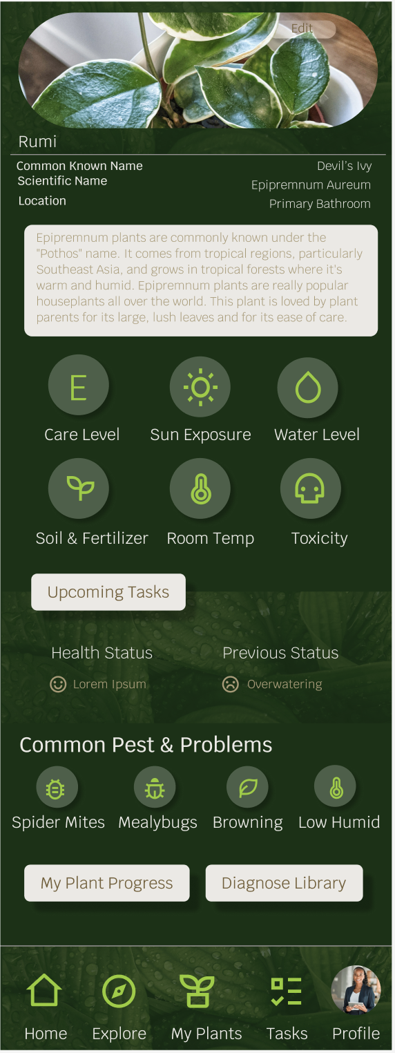
To solve the issue of complex navigation, I designed the homepage to feature direct access to the app's core functions. This streamlined approach complements the digital library, which was created to serve as a comprehensive record. Here, users can track diagnostic history, review past issues, and access a detailed timeline of care, reducing the need to search for information and providing a clear overview of their plant's health.
Most important and easily accessible based on user persona’s need for plant app. Reminders for plants in order, progress tracker with most recent, and library to diagnose or of diagnosed plants
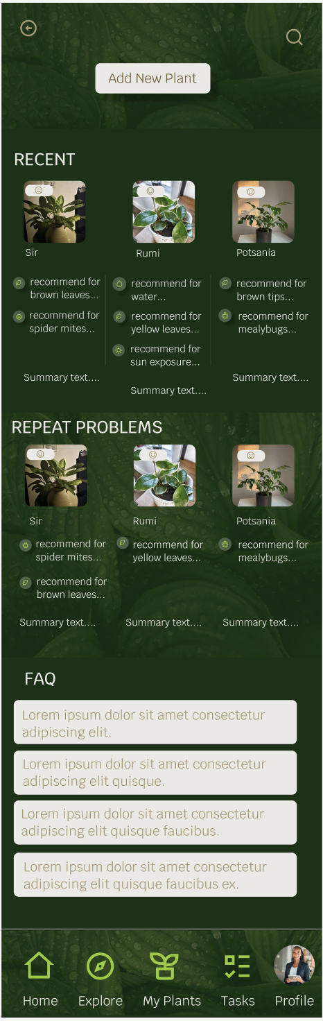
Home Page
Most recent plants added, with their current health status, previous tips, and brief summary.
Diagnose Library

Plants that have had repeated issues, summary, status.
FAQs about common issues that cause harm to plants, like pests, temperature, mold, etc.
To simplify the process of adding a new plant, I designed a low-fidelity prototype that streamlines the journey. The prototype guides the user through creating a plant profile, which includes instant species identification, followed by setting up automated care reminders, ensuring a smooth and effortless setup.
Research Goals
This study sought to determine if the app's design is engaging and intuitive. My primary goals were to evaluate the user's ability to accurately diagnose a plant's health and to effectively utilize the reminder functionality.
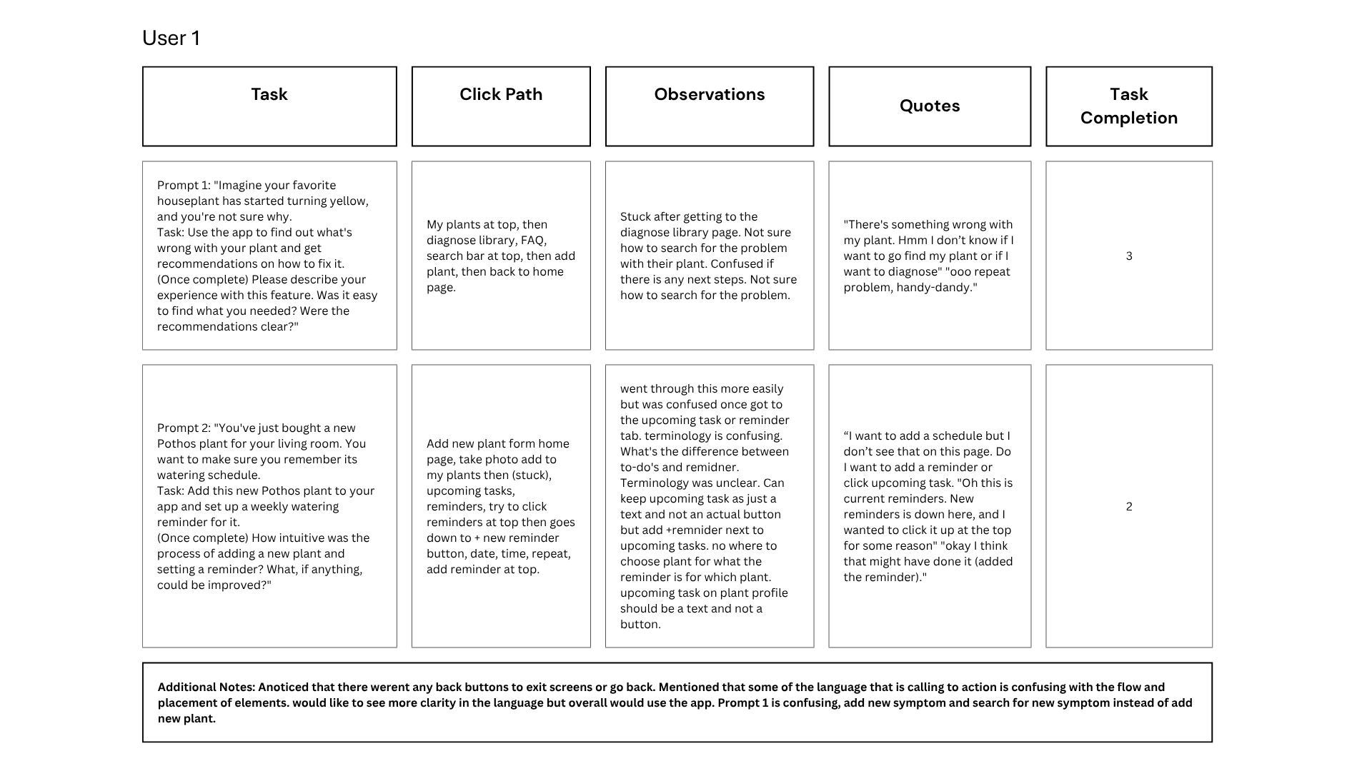
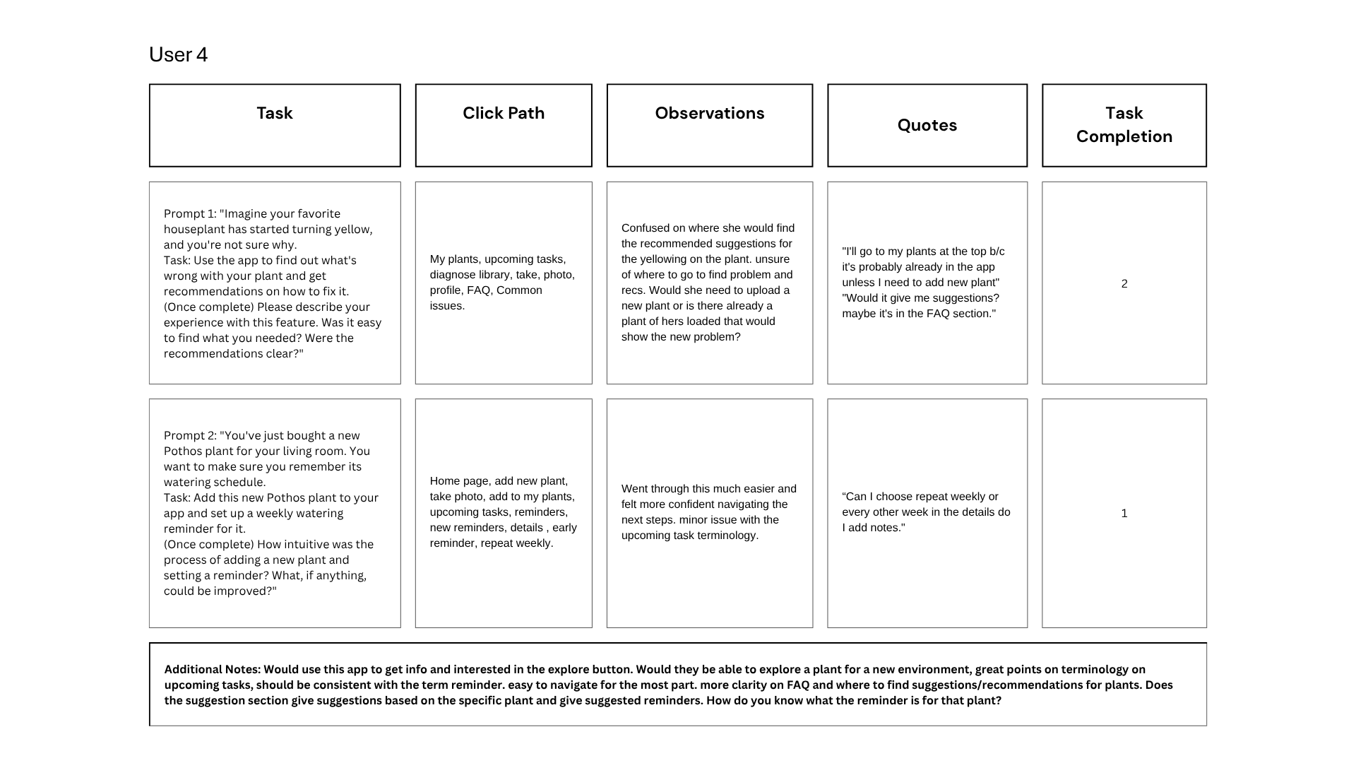
Usability Study Findings & Solutions
Based on the usability study, I identified several key pain points:
Plant Diagnosis: Two of four participants were unsure how to diagnose a new plant from the home screen. My proposed solution is to streamline the flow, reducing redundant steps and making the diagnosis process more intuitive.
Reminders: Two of four participants had difficulty finding the "add new reminder" button. This suggests we should make this button more visible or, even better, automate the reminder feature to reduce user effort.
Tips & Recommendations: Two of four participants struggled to find the tips and recommendations. This indicates that diagnosis and tips should be the primary content shown immediately after a user uploads a plant.
Refining The Design
Low Fidelity Mockups
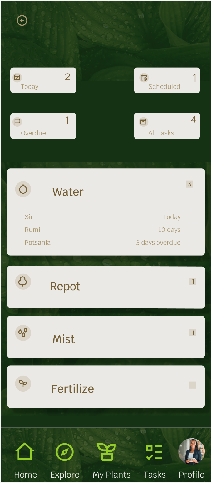
Based on usability study feedback, I refined the design to reduce user confusion and streamline key tasks.
Problem: The initial prototype confused users with redundant reminders and a disorganized task list.
Solution: I introduced automated reminders to simplify the process and reorganized upcoming tasks into a new dropdown button for better organization. I also added buttons for a plant's progress and diagnosis history, giving users a more complete view of their plant's journey.
Before


After
User Flows (Before & After)
The initial user flow was limited, with users only able to navigate using the bottom bar. To improve usability, I redesigned the flow to add explicit navigation buttons (back arrows and an 'X' button) to each screen. This change, along with the addition of Explore and Community pages, provides users with a more comprehensive and intuitive path through the app.
High Fidelity Mockups
High Fidelity Prototype
Before

On the Home page, I incorporated the new Explore section and updated the language for reminders to eliminate user confusion. On the My Plant page, I made a key change by automating reminders, removing the need for manual entry and reducing user stress. This page now also gives users direct access to upcoming tasks, a plant's diagnosis history, and its health progress.
This redesign focuses on creating a more intuitive user flow, ensuring new plant owners can easily understand and care for their plants with confidence.
After

I focused on creating a seamless user journey from discovery to care. The user begins on the home page and is guided through a streamlined process to add a new plant. The app intelligently identifies the species and provides specific information. After creating the plant profile, the user is then prompted to add personalized care reminders, ensuring they have the tools they need for long-term plant health.
This prototype highlights my ability to design a logical, intuitive, and helpful user flow from start to finish.
Going Forward
Takeaways
Impact:
After sharing the final prototype with participants from the usability study, one participate stated: “This looks awesome! I would be excited to use it if it were to become an actual app. It would make me feel more confident being a plant owner since it’s easy to navigate and the design is welcoming.”
Another participant stated “This app is super helpful for keeping my plants happy and healthy. The reminders, knowledge, and bright, engaging visuals make it easy to stay on top of care routines. It’s still in beta, but it’s off to a great start—excited to see how it grows!”
Feedback affirmed that the design goal was achieved and my design choices successfully prioritized usability and clarity.
What I learned:
Outside of the fundamentals of the design process, I learned to balance user needs with business goals while keeping the user in mind and asking the right questions while limiting bias. I deepened my skills in, Figma, wireframing, prototyping, and usability testing, and learned how iterative feedback can transform a good idea into a truly user-centered solution. Most importantly, I gained a deeper understanding of the ambiguity of designing user-centered products and trusting the process.
Next Steps
Expand the scope of the user research
To strengthen the case study, I would conduct additional user interviews and usability tests with a more diverse group. This would help validate the design decisions and uncover edge cases or unmet needs that weren’t captured during the initial research phase.
Explore design scalability and edge cases:
With the high-fidelity prototype complete, I’d explore how the design scales across different user scenarios, screen sizes, and accessibility needs. Documenting these considerations would add depth to the case study and demonstrate how the design could evolve in a real-world context.